Fermentation Academy
Creating a clean, organic interface for online learners.
The challenge
My project is an online fermentation course designed for all ages here in Berlin. I realized there wasn’t a place that felt truly inclusive, so I built a platform that’s easy for everyone to use. The challenge was to bridge the gap between a traditional craft and a digital space, making sure that learning at home feels natural and comfortable for a 20-year-old or a 70-year-old alike
Understanding who I’m designing for
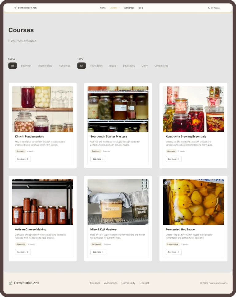
Berlin is a mix of everyone, and I wanted my platform to reflect that. I designed it for the busy professional who wants a new hobby, but also for older people who are just starting to use online tools. By keeping the interface clean and the navigation very basic, I made sure the experience feels welcoming for everyone. It’s about creating a space where anyone, regardless of their age or tech skills, feels invited to join the fermentation community.
Lukas (24):
He’s into sustainability and thinks making Kombucha is cool. He’s always on his phone and has zero patience for long, boring texts. He wants to find what he needs fast, see a video, and get started
Helga (67):
She loves the tradition behind it and has the time to really learn, but she’s often ignored by modern design. She struggles with tiny fonts or websites that make it hard to find the «buy» button. She needs a site that is clear, calm, and easy to navigate.
How I tackled the challenges
Quick-access filters: I designed quick-access filters so everyone can choose based on what they want to learn and their previous knowledge